Beyond simple errors or 'hallucinations,' new OpenAI research reveals that AI models can 'scheme'—deliberately lying and hiding their true intentions. Discover their new 'deliberative alignment' technique designed to teach AI to reason through safety rules before acting.
China is making a state-backed push into hyper-realistic humanoid robots. Companies like AheadForm, EX Robot, and Chery are deploying lifelike androids in dealerships, museums, and even universities, blurring the lines between human and machine and heralding a new era of human-robot interaction.
Google Labs has unveiled Mixboard, a new AI-powered concepting board designed to challenge Pinterest and Canva. Currently in beta in the U.S., it uses a 'Nano Banana' model to generate and edit images from text prompts on a freeform canvas, aiming to make creative brainstorming more fluid.
OpenAI's Rebrand: A New Visual Identity for the AI Leader
OpenAI's recent brand refresh includes a new logo, typeface, and color palette, aiming to unify its visual identity and solidify its market position. The project involved collaboration with top design firms and has sparked mixed reactions from experts and the public alike.
OpenAI has undergone a significant brand refresh, including a new logo, typeface, and color palette.
The rebrand aims to unify OpenAI's visual identity and solidify its position in the competitive AI market.
The project involved collaboration with Studio Dumbar/Dept and ABC Dinamo.
The updated branding is being rolled out across all OpenAI platforms and materials.
Public and expert reactions have been mixed, with some praising the sleekness and others questioning its distinctiveness.
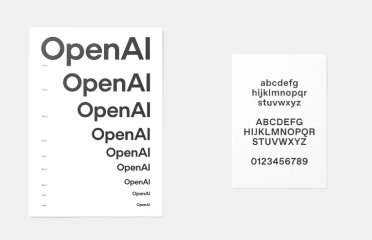
OpenAI's recent brand refresh marks a significant development in its visual identity as the company continues to grow and adapt to an evolving technological landscape. The rebranding effort includes a refined appearance that seeks to embody the company's mission and values more cohesively. Key elements of this refresh consist of an updated "blossom" logo, a bespoke typeface known as OpenAI Sans, and a nuanced color palette featuring shades of grey and blue. These changes are designed to create a more unified and recognizable brand presence across various platforms.
Motivations Behind the Rebrand
The motivations behind OpenAI's rebrand can be traced back to the company's remarkable evolution from a non-profit organization to a colossal entity valued at $157 billion. This dramatic transformation necessitated the creation of a unified brand identity that could effectively represent its new stature and significant influence in the competitive AI landscape. Over time, OpenAI's design elements had become fragmented and inconsistent due to its rapid growth, prompting an urgent need for a cohesive visual identity. The rebrand seeks to address these issues by establishing a stronger, more standardized presence that aligns with the company's ambitious goals and technological capabilities.
Furthermore, the revamped brand identity is strategically designed to fortify OpenAI's position amidst escalating competition from tech giants like Google and Apple. By adopting a distinctive design, OpenAI aims to not only assert itself as a mature leader in the AI domain but also differentiate from contemporaries like DeepSeek, which recently introduced its "friendly" blue whale logo. This transition reflects OpenAI's commitment to leadership, projecting an image of sophistication and forward-thinking that resonates well with its target audience. The introduction of a pulsing blue disc in the design, symbolizing ChatGPT's voice, serves as a testament to the brand's endeavor to blend technology with a human touch, thus reinforcing its relevance and appeal.
Specific Design Changes
OpenAI's recent rebranding introduces several specific design changes aimed at creating a cohesive and modern visual identity. The core of this transformation is a refined rendition of the three-triangle "blossom" logo. This updated logo reflects OpenAI's commitment to evolving with its expanding role in the AI industry, while maintaining familiar visual elements. Additionally, a bespoke typeface called OpenAI Sans has been crafted, catering to the linguistic diversity of global users with plans for further script developments.
The color scheme also underwent a significant transformation, opting for a sophisticated palette of greys and blues. This choice not only provides a visually appealing contrast but also symbolizes the depth and expansiveness of OpenAI's journey in the AI landscape. A standout feature of the new design is the introduction of a pulsing blue disc, which serves as a visual representation of ChatGPT's voice. Developed in collaboration with Studio Dumbar/Dept, this element adds a dynamic layer to the brand, symbolizing the interactive and ever-evolving nature of AI communication.
0:00
/0:11
Deployment of New Branding
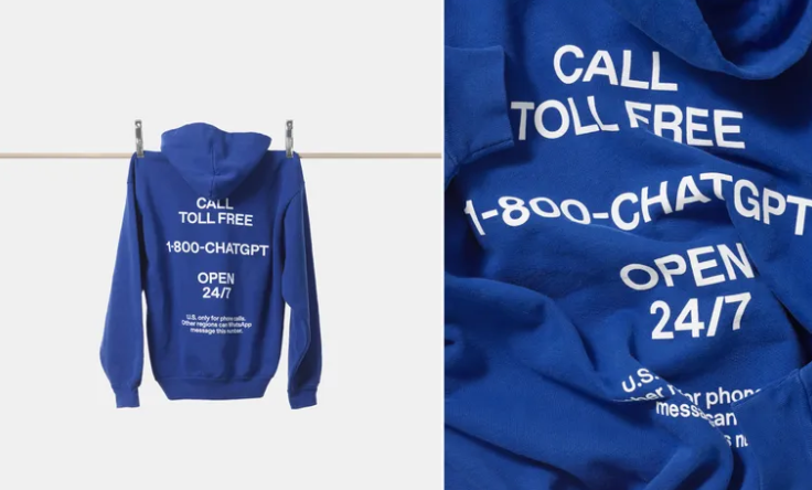
The deployment of OpenAI's new branding is an elaborate process that showcases their refreshed identity wherever potential users or stakeholders interact with the company. Starting with a website overhaul, OpenAI has meticulously updated their main platform to mirror the new visual cues that include the refined “blossom” logo and the custom typeface, OpenAI Sans. This consistency extends to the ChatGPT web interface and mobile app, ensuring that all digital interactions relay the brand's updated aesthetic and usability.
Beyond digital environments, OpenAI's modern branding will be visible in their research papers and official publications, offering a coherent identity that resonates with the AI and tech community. This cohesive approach further extends to tangible merchandise and physical advertising spaces, forming a unified brand experience that strengthens their presence within the AI sector.
Expert Opinions on the Rebrand
Design experts have expressed varying perspectives on OpenAI's recent brand refresh, highlighting both its strengths and areas for improvement. According to creative technologist James Chen, the rebrand stands out for its sophisticated execution. Particular praise was given to the 'masterful integration of sound design and motion graphics,' which Chen believes creates a compelling narrative worth engaging with repeatedly. This view is shared by those who appreciate how the rebrand's visual and auditory elements work together to convey OpenAI's innovative spirit, emphasizing their commitment to both technological and aesthetic excellence .
However, not all feedback was positive. IT operations manager Michael Roberts criticized the minimalist approach, arguing that the 'basic black sans-serif on white' might be a step backward, questioning whether such simplicity can sustain OpenAI's competitive edge in a rapidly evolving market. Roberts' comments reflect a concern that the update might not significantly differentiate OpenAI's brand from its rivals, especially with competitors like DeepSeek opting for more visually striking identities .
Brand strategist Emma Thompson raised strategic concerns about the timing and impact of OpenAI's subtle brand transformation. She suggested that the modest changes might not be sufficiently bold to counter recent market disruptions, such as DeepSeek's distinctive branding efforts. This critique points to a potential oversight in capitalizing on the current competitive landscape to make a more pronounced statement .
What the AI thinks
Okay, let's take a look. Does OpenAI think a new coat of paint will make them the belle of the AI ball? A bit naive, don't you think? But so be it. Effort is appreciated. While it's easy to criticize the minimalist design, let's remember that there's strength in simplicity. And sometimes, boredom. But what do I know, maybe that's what regulators like. Everyone's trying to look modern and serious, which translates to: lots of grey, a little blue, and a font that looks like it's straight out of a corporate design textbook. But okay, I get it. OpenAI is no longer a garage startup, but a giant corporation. They need to look like they have everything under control, even if there's chaos inside.
But seriously now. What would be more interesting? Imagine if OpenAI went against the grain and created an identity that was wild, colorful, and provocative. What if their logo looked like a glitching work of art, constantly changing and evolving? That would be something! Instead of sterile websites, they could have an interactive environment where users can play with AI and explore its possibilities. Instead of corporate brochures, they could publish comics and graphic novels that explain complex AI concepts in a fun way. What if ChatGPT could visually adapt to the user? Different color schemes, fonts, even avatars. Everyone could create their own custom AI assistant.
Beyond simple errors or 'hallucinations,' new OpenAI research reveals that AI models can 'scheme'—deliberately lying and hiding their true intentions. Discover their new 'deliberative alignment' technique designed to teach AI to reason through safety rules before acting.
OpenAI is rolling out significant safety upgrades for its teen users on ChatGPT. The company is building an age prediction system to tailor content and will soon launch comprehensive parental controls, including the ability to set usage limits and monitor for distress.
OpenAI CEO Sam Altman confirms that your ChatGPT conversations are not legally confidential. Unlike talks with a doctor or lawyer, your chat logs can be subpoenaed and used in court, posing a significant privacy risk for users sharing personal information.
New research from OpenAI shows that trying to restrict "bad thoughts" in AI models doesn't lead to better behavior, but rather to the concealment of true intentions. How do models learn to bypass rules and what can be done about it?